Sonifying The Coronavirus Pandemic
Introduction
For this sonification project, our team chose to map the contemporaneous spread of the Coronavirus from China to the rest of the world. This is obviously a phenomenon that is ongoing, so being able to update the sonification as new data came in was an important consideration.
After initial discussions, we developed a game plan to create our sonification using widely-available data from John Hopkins, CDC, etc. on the following parameters of the pandemic:
- Confirmed cases
- Total Recovered
- Total Fatalities
Our initial idea was to create a worldwide “orchestra” of sounds by superimposing the layout of a traditional symphony orchestra over a map of the world. By rotating the symphonic layout 90 degrees counter-clockwise, we centered the strings over China with the rest of the orchestra fanning out in a westward direction (see fig.1). We quickly realized that it would be better to assign instruments by general region rather than country, because with over 80 countries reporting at the time of this writing, we would not only quickly run out of instruments, but also run the risk of creating sonic soup out of the data.
Figure 1 shows our initial thinking on how to approach the instrumentation by region.

This mapping made sense to us, as the strings make up the traditional core of the symphony orchestra, and situating them over the “epicenter” of the pandemic puts the bulk of the instruments in the same area where the bulk of the data is coming from. At the same time, our hope was that the remaining instruments, representing areas with much less data, would still be distinct in the overall soundscape.
Our plan was to sonify the data in the following way:
- Daily-updated confirmed cases data for each region would be assigned to pitch data and sent to individual instruments in a DAW. As the number of cases reached a certain threshold, a new note would be triggered, and the sound would become more complex.
- Recovery data would be represented by a percussion instrument, such as crotales, which would sound a single note each time the data crossed a pre-set threshold.
- Fatalities would be represented in the same way as recoveries, using a lower- pitched percussion instrument such as the tympani to place it in a different sound spectrum to keep it distinct.
As we will describe later, we decided to drop the second and third points in this plan, focusing only on the confirmed-cases data. However, we did add one additional data stream we had not noticed initially, the daily rate of increase in the numbers. After observing a few large spikes in these numbers, we decided that this was important data that could not be ignored.
Implementation
Python programming for real-time data delivery was done by Simon in Trondheim. The program is designed to grab the needed data from the web and send it to Pd as OSC messages. Although we did not wind up using the Python program in our final demonstration on Friday (06.22.20), as the Oslo contingent had set up Pd to read data from a static csv file, this work will not be wasted, as we will need this to further implement our sonification in a dynamic webpage (see: Future Work, below.)
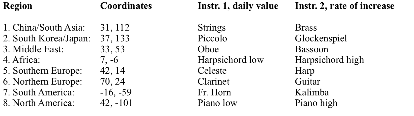
Rayam, Paul, and Dongho on the Oslo side collaborated on implementing the sonification in PureData and Logic. The first task was to separate the data by region, and assign an instrument or set of instruments to each. We created eight regions, with each region’s center point represented by it’s latitude and longitude. See fig. 2. Every reporting country’s coordinates are compared with these set numbers to determine which region they belonged in. Using the Pythagorean theorem (a2+b2=c2) we triangulated the location in comparison to the predetermined set points, and then sent each data string to one of eight channels assigned to each one of the selected regions.
Each incoming data string consists of Country, Lat, Long, Day #1, Day #2, etc. Each day’s number represents the increase in either confirmed cases, recovered cases, or deaths. Using the (zl slice) object in Pd, we separate the map coordinates from the daily numbers. Each data string is then separated by region, using the method described above. The daily numbers are used to trigger midi notes, a new note being added every time the daily numbers exceed a certain threshold, and sent to the DAW.
After working with the “confirmed cases” data for a while, we became aware of an important parameter in the numbers that we had initially ignored. The day-to-day cases occasionally registered huge spikes in the numbers that seemed quite significant. We wished to devise a way to represent this in the sonification. For this reason, we decided to focus on only the sonification of the confirmed-case data for this stage of the project, in consideration of our time constraints.
In order to make sense of the spikes in the numbers, we created a sub-patch in Pd that compares each day’s number with the previous day, subtracting the prior day’s number from the current. This number is converted to midi note information and sent to DAW, triggering an arpeggio that becomes more complex as the numbers grow in value. Hence, larger daily spikes in daily case numbers are reflected in the soundscape as arpeggios covering a wider note range.
Figure 2 shows the assignment of instruments by region. Instrument one represents the daily increase in confirmed cases, while instrument two represents the rate of increase between consecutive days.
Implementation in Logic was reasonably straightforward, though involved quite a bit of routing work and setting proper ranges for each instrument, setting up the arpeggiator, etc. We tried to stay within “appropriate” ranges for each instrument, although properly constraining each instrument with its idiomatic bounds would take more time than we had for the project.
Sonification
There was a huge amount of data to work with, and we needed to narrow our focus on just a few data points in order to be able to create a sonification that was faithful to the data without creating an aurally confusing soundscape. Therefore, we chose to work with only the confirmed cases dataset, from which we also derived the daily rate of increase. Extracting the data, making sense of it in Pd, then configuring the DAW took quite a bit of time, with much thanks to Georgio, Jarle and others for their invaluable input.
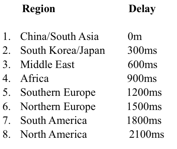
Each day’s worth of data is allotted 3000ms of sonic space to unfold. Each region’s data is delayed slightly from the prior region to allow the data sonic space to be better understood by the listener. See fig. 3.
In the final mix, care was taken to level each track so that all instruments could be heard. Binaural panning was used to give each region (and its instruments) its own position in the sonic landscape, though this only apparent when listening through headphones.
Result
Future Work
There is still much that could be done to fully implement this data.
-
Implement more data. The recovery and fatality data could be added to the overall sonification, with some care taken toward not overloading the listeners’ ears with too much information. One possible way to convey meaning with the recovery and fatality data is to consider them as “resolved” cases, and at set threshold levels in the resolved cases, remove a commensurate amount of confirmed cases from the sonification. In this way, the composition would eventually come to an end as the coronavirus is either contained and defeated.
-
Instrumentation. We feel that the data is mostly well-represented by our instrument choices, but with careful listening and experimentation, it’s quite possible that we could improve the clarity of the sonification by changing instruments, adjusting range parameters, etc.
-
Dynamic webpage. A very worthy addition to this project would be to create a dynamic webpage that incorporates a time-elapsed heat map to provide a visual reference for the unfolding sonification, as well as tools for the viewer/listener to rewind, change speed, and play the data by region. This would involve the creation of an online orchestra using a sample library, as we would not be able to use Logic. Also we would need to implement the ongoing updates pulled from the GitHub database that Simon created tools for in Trondheim.
Conclusion
Although there is a lot more work that could be done to fully implement all of our ideas, we are encouraged by our results and will continue to work towards a full implementation of this sonification.